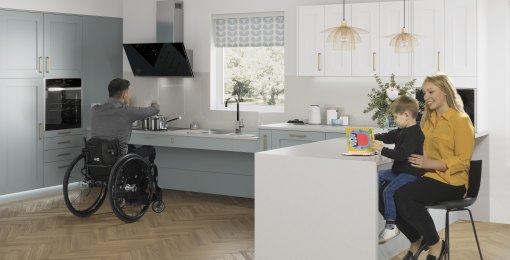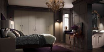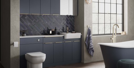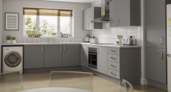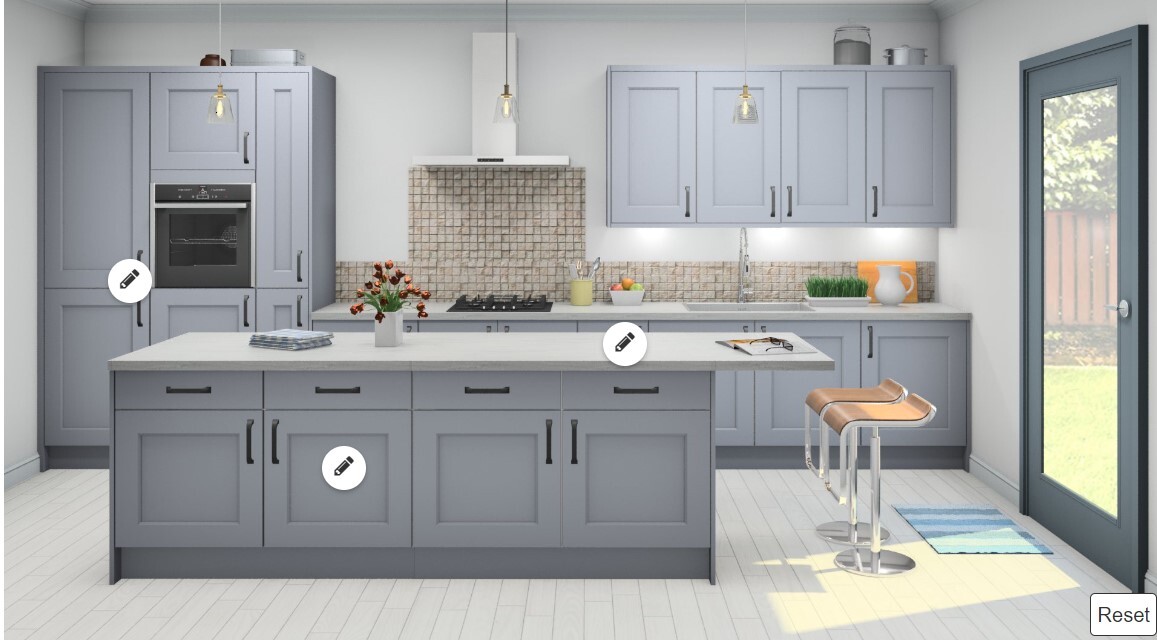
Gallery by Symphony has unveiled a brand new look to its retailers; supported by a new brochure and POS, the suite of literature now incorporates an Options brochure. The new look brochure uses inspirational imagery and focuses on details and themes to help customers identify their ideal kitchen style; an idea which has been inspired by Pinterest and creating mood boards for each collection. The Options brochure is designed to assist in making important choices, such as paint colour, handles or finishing touches once the overall theme of the kitchen has been decided.
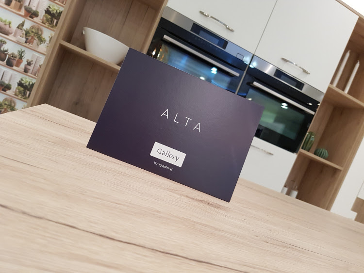
The project started last year with a survey of Gallery retailers. The survey asked what was the most important aspect of the brand and what would they want more of. Gallery were asked to improve the brand positioning and expand on the existing POS, which is why such a significant investment has been made to ensure that retailers get what they need.
Robert Newton, Head of Marketing, said:
“The key themes that came out of the research was that overall our retailers were happy with our service, with over 96% of retailers being willing to recommend us, but that it was time to review the look and style of the literature. To show that Gallery is a modern kitchen brand we’ve used different trends and styles, such as using copper tones or the industrial theme, to influence the look of the brochure. We’ve expanded our range of POS, including items that highlight our free replacement ends, which is an exclusive benefit of Gallery and helps customers keep their costs down.”
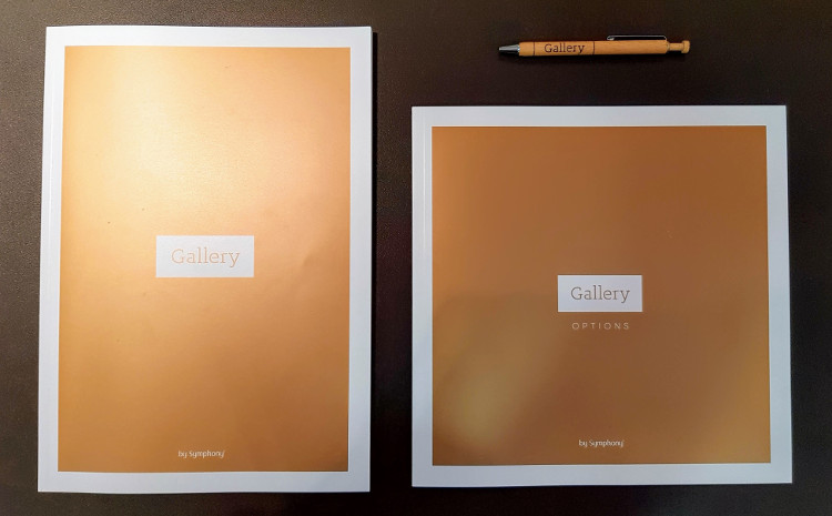
Symphony is dedicated to supporting its network of retailers by offering the latest colours and styles in the Gallery kitchen brands. New brochures, POS and a Design and Price Guide were unveiled to the retailers to support the new July 2017 launches.


